The Accordion Block is an easy way to make large amount of text clearer and divide it into smaller and more digestible sections. So if you have long text with a lot of headings and paragraphs, you can use The Accordion Block to break it into small blocks that can be expanded by clicking the arrow next to the heading. In addition to the text, all other basic blocks can be inserted into the accordion.
How to create an accordion
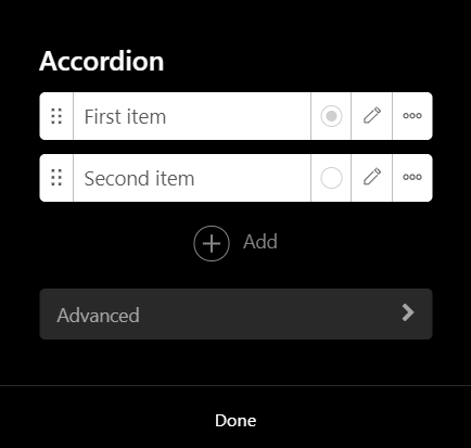
After dragging The Accordion Block to the page, a default accordion with two items will appear. By clicking the middle of the block, you can edit both the accordion itself and the individual block in it.

The purple border of the accordion means that it is a block into which all the basic blocks can be inserted the same way as directly on pages. All blocks that work similarly are also bordered in purple and cannot be inserted into each other. These are specifically the blocks form, box, price list, accordion and newsletter. All other blocks can be inserted into the accordion. These blocks inside the accordion have a blue border and their own settings.
Adding and managing items
After clicking The Accordion Block, you can get to the settings by clicking the purple gear next to the label "Accordion". You can see all existing items in the newly opened window. By clicking the "Add" button, you can then add any number of other items to the block.
For individual items, you can change their headings in the text box. Next to the text field there is a button with which you can set the field as active. This means that this item will be automatically expanded when you open the website.
Clicking the pencil icon will then take you to the settings of each item, which will be described in more detail in one of the following sections of this article.
The last icon of the three dots expands the menu with the option to duplicate or delete the item.
Advanced settings
In the advanced settings, the ID can be very useful to you. It is used to create a link using an anchor. You can learn more about setting up and using anchors in this article.
Item settings
The settings of each item can be opened by clicking the gear icon that appears when you hover over the item.
In these settings, you can change the background color of the expanded item. You can also set a picture or video in the background.

Other settings
In the Other settings tab, you can make the text color adjust according to the background of the item.
Advanced item settings
In the Advanced tab, as with all blocks, you can create anchors using ID.
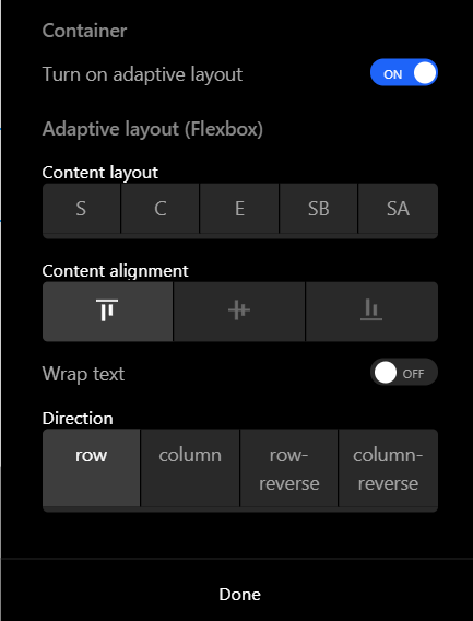
In the Container section, it is then possible to turn on adaptive layout of content. This setting ensures that the content is displayed correctly on all devices.
Next, you can adjust the layout of the content with left, right and center alignment. Alternatively, you can also select a center alignment with different offsets from the edges. You can also turn on content wrapping.
In the last part you can align the content into rows or columns. You also have the option to flip rows and columns.
You can then adjust the appearance of these settings in the tab Design -> Container -> Accordion. For example, you can change the indent size, border, background, or description here.